Kitchen Reveal
I am so excited to finally share our kitchen renovation today! I love how this kitchen came together, from the initial design concept to the final details. Read and scroll for more!
The History
A little history on our kitchen. This renovation has happened slowly and over time - not something I really recommend, but that’s just kind of how it happened in this space. When we moved into our house, (a 1940s craftsman bungalow in the heart of Dallas) this kitchen had no dishwasher, vinyl flooring, no vent system … and a lot of orange and brown. It was a bit of a mess! (Scroll all the way down for the before pictures!) Since the cabinets and counters were in good shape and we had other priorities, I think all we did upon moving in was installing a dishwasher, and of course a fridge. Projects happened slowly here and there over the next couple of years - eventually a few cabinets were rearranged (and the oven and microwave), space was made for open shelving, a new window, new sink, new faucet, and new counters were installed. It looked a lot better, but for several reasons (read more here), refacing the cabinets and adding a couple new ones was the best next step in making the best use of the space. The kitchen isn’t tiny, but it’s also not a large space, so every inch counts. I think I can say now that not only has this project maximized space, it really feels finished!
The Design
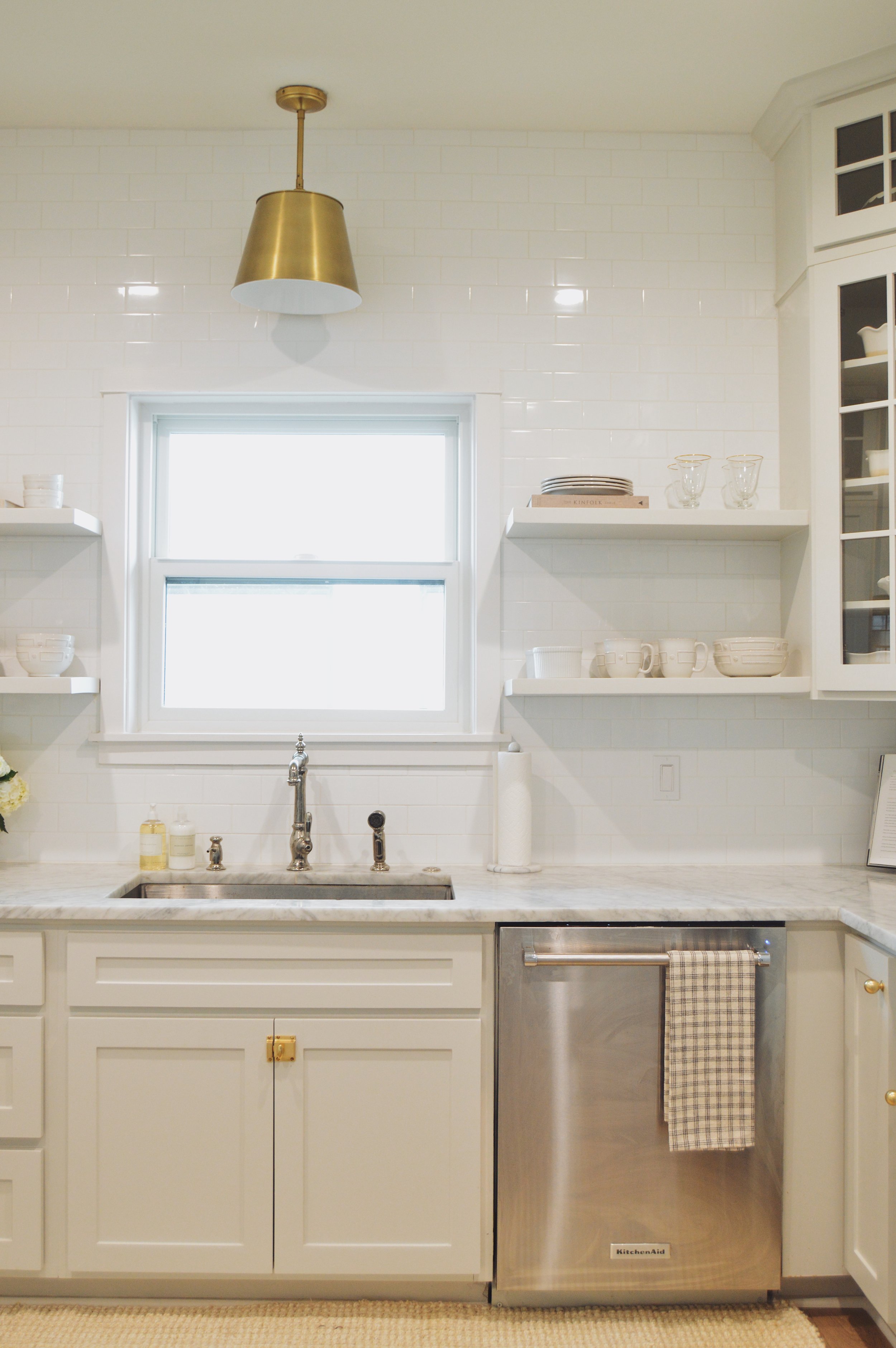
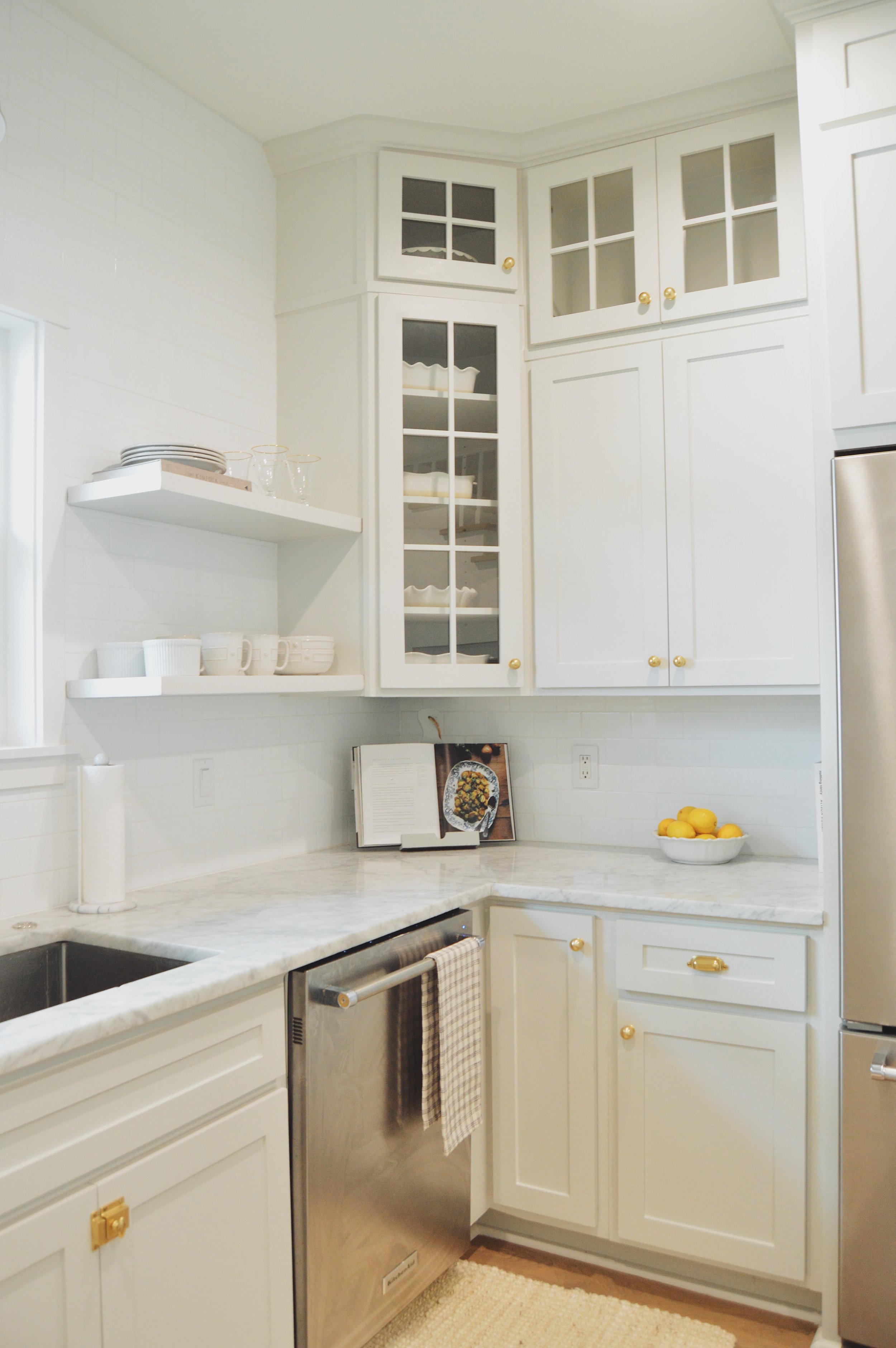
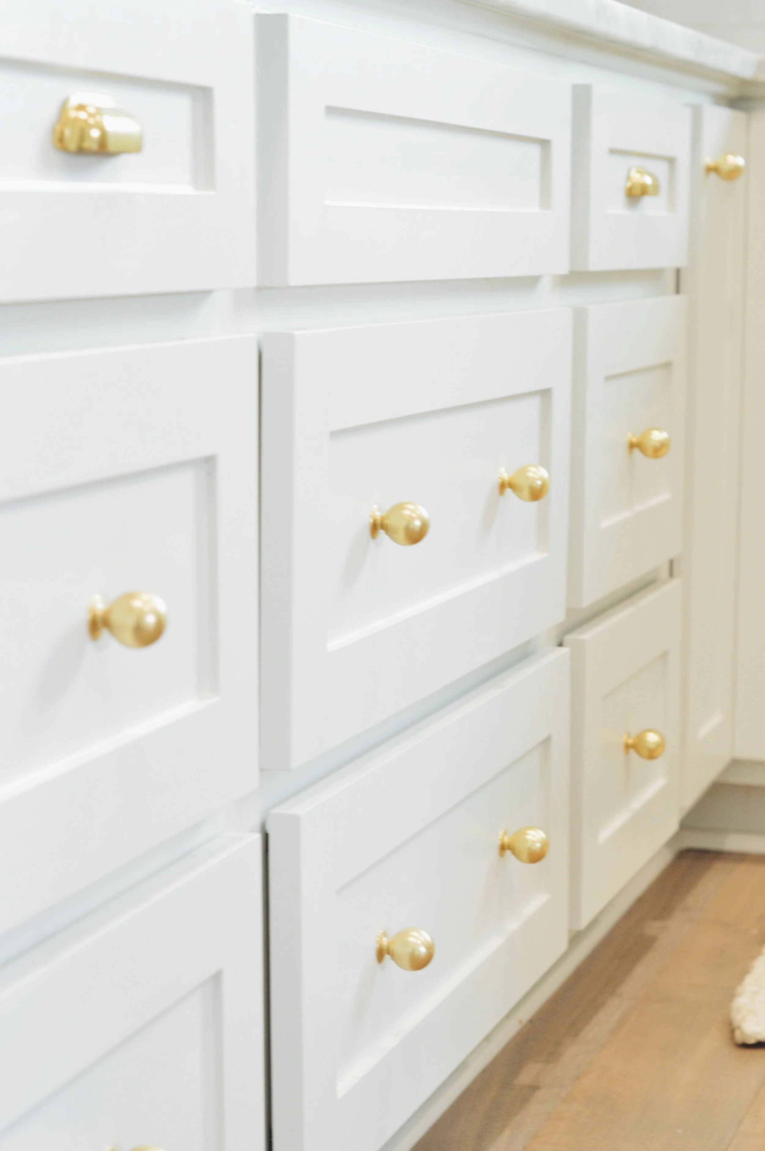
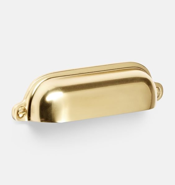
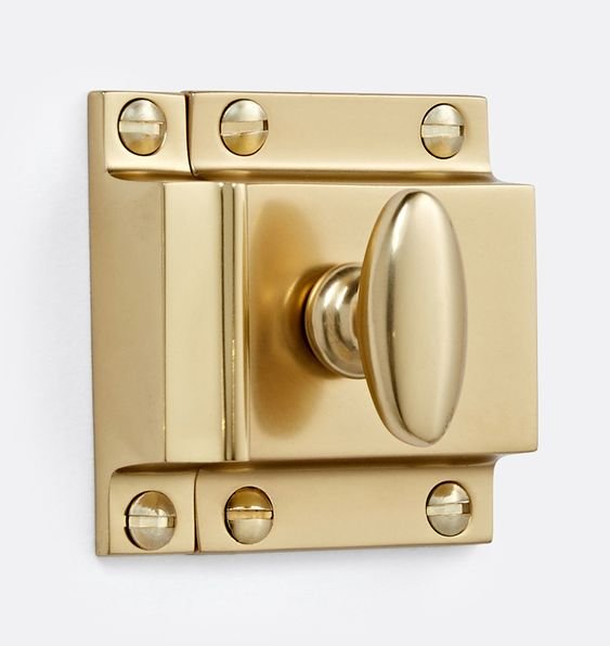
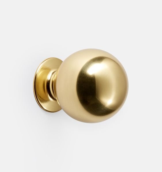
Needless to say, I love nothing more than browsing through beautiful kitchen designs, saving pieces of inspiration here and there over the years. I ultimately wanted to create a clean and classic space that felt like it fit the home (traditional craftsman) but updated, and I feel like I really accomplished a lot of what I set out to do with this kitchen! The biggest challenge was picking out paint colors - I wanted to get it exactly right! I can wholeheartedly say I love our cabinet color so much. It’s the perfect blue-gray-cream-green blend. It’s light enough that it reads as a neutral, it picks up the tones and veining in the carrera marble counters, and it sets off the white backsplash and ash wood floors really beautifully. The aged brass hardware I picked from Rejuvenation exceeded all my expectations and really pops against the cabinet color. I love the mix of brass and polished nickel throughout the space - as you’ll notice, the sink hardware is polished nickel. It felt a little more classic and I love how it looks! I think the mix of the two metals with marble counters feels really well balanced.
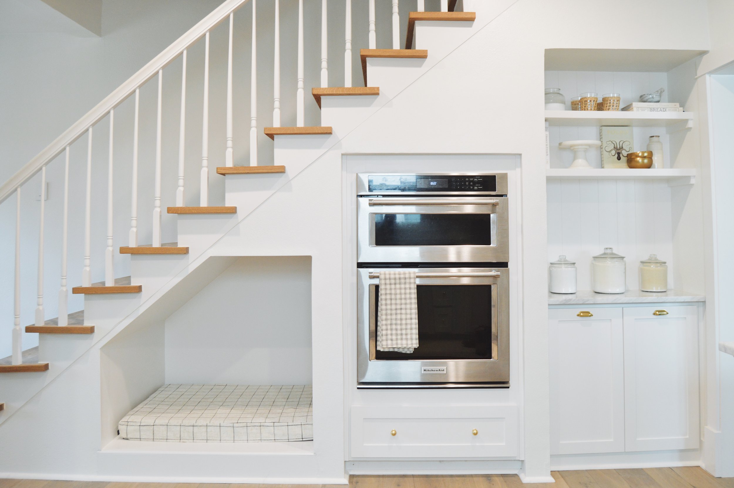
I have so many favorite design details in this room, but undoubtedly, my favorite is Josie’s cubby under the stairs. Josie loves being with me in the kitchen when I cook, so I wanted her to have her own little space! Another favorite detail is the floor-to-ceiling shelving on the side of the fridge cabinet - storage and charm all in one. The marble counters are another detail I will love forever - they’re timeless and so beautiful, even after a few scratches here and there.
I loved designing this space, and I hope you love it as much as I do! I’m no professional - designer, photographer, or stylist - but I think for a first kitchen renovation, I’m proud of what we were able to accomplish here. Keep reading for all of my prior kitchen posts, sources, and links!
Prior Kitchen Renovation Posts
I talked about my dream kitchen and kitchen renovation plans here
I talked about the design concept here
I shared the sketches and plans for our cabinet refacing here
The Before Photos
Sources
Cabinets - Shaker Style
Cabinet Hardware: Rejuvenation, Aged Brass
Paint Colors: Kitchen Cabinets: Benjamin Moore Gray Owl, Lightened 25%, Bar/Oven Area: Sherwin Williams Snowbound
Tile: Imperial Bianco Gloss, White, The Tile Shop
Counters: White Carrera Marble
Flooring: Valaire Alps White French Oak, 6”
Appliances: Kitchen Aid
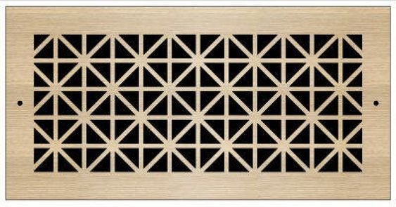
Custom Laser Cut Register: Pacific Register


